Visual
Communication
Communication
How can design clarify BUDDYs mission, attract new patrons, and support the local art ecosystem?
BUDDY is a store in the Chicago Cultural Center in downtown Chicago with the mission of supporting and showcasing local artists, makers, and small businesses. The storefront boost a number of programming initiatives: exhibitions, talks, workshops, performances, readings, and an art retail space.
Our goal was to guide visitors to the shop to create moments of discovery. The simplified geometry can be seen from Michigan ave and the L, guiding pedestrians to points of interest. By positioning BUDDY as hyperlocal, it becomes a site specific art hub where patrons can find unqiue work not available anywhere else.

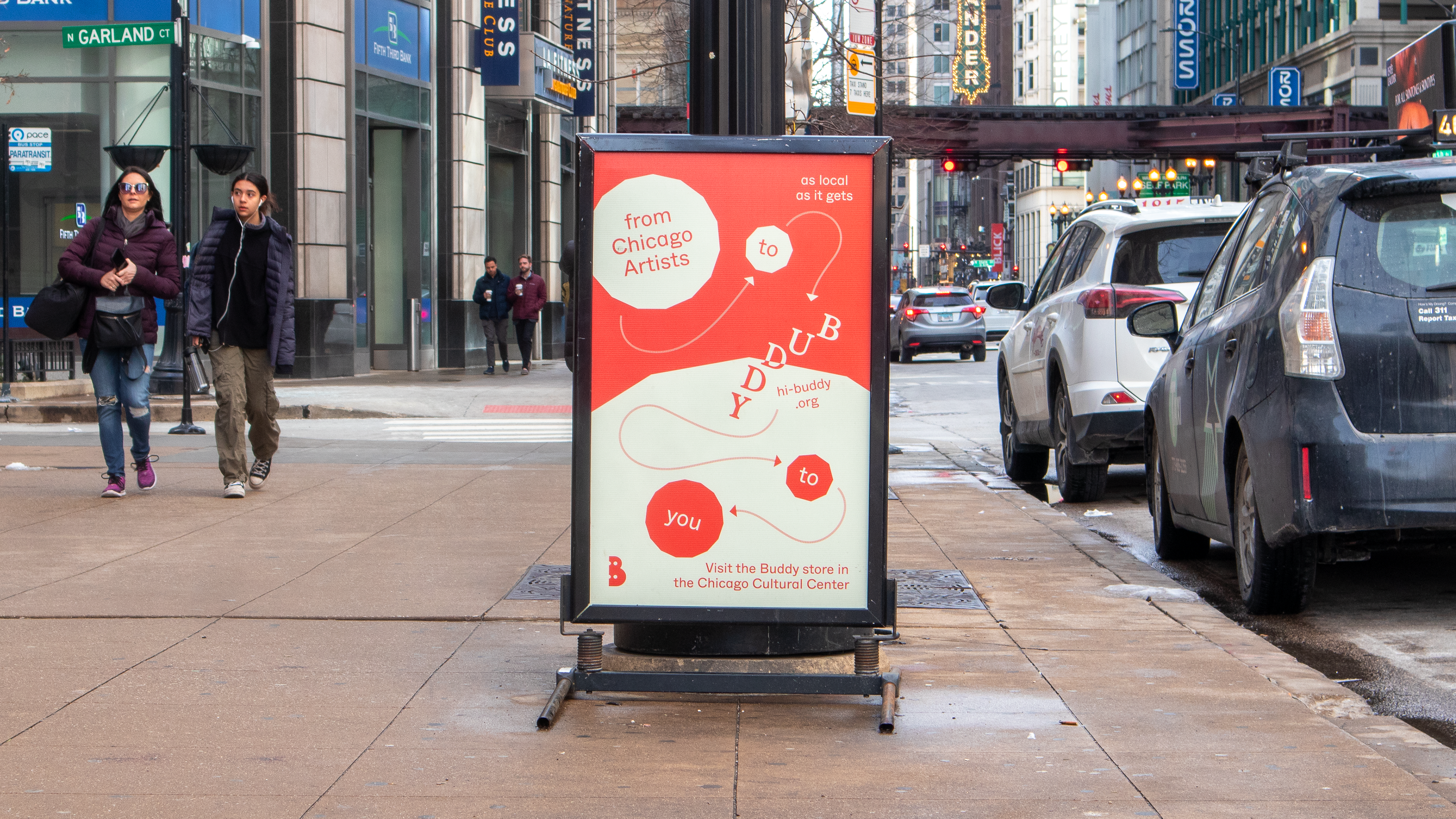
BUDDY
Signage + Messaging, 2022
with Josh Cook and Layne Thue-Bludworth
Identity Systems
How can an identity system clarify the partnerships between institutions, while emerging as a unique organization?
The Institute for Healthcare Delivery Design advises healthcare organizations, departments of public health, payers, and policymakers to improve the quality, safety, and value of care. Grounded in design methodology, IHDD approaches problem solving using a combination of a inter-disciplinary approaches to innovate in the healthcare space.
IHDD was contracted to design an identity system for the new Medicaid Technical Assistance Center. MTAC is a unique partnership between the Illinois department of Healthcare and Family Serivces, and the University of Illinois Systems.
How can an identity system clarify the partnerships between institutions, while emerging as a unique organization?
Working within the framework of the newly launched identity system for the Illinois department of Healthcare and Family Serivices, I created a number of unique geometric forms that could position MTAC as an innovative, trustworthy organisation that can help stakeholders navigate the complex medicaid system. The identity will be rolled out in tandem with HFS programming innitiatives. MTAC can currently be found at >HFS


Visual design + Identity Systems,2023
Art Director Robert Zolna
Institute for Healthcare Delivery Design
Identity Systems
How can the OMI wordmark signify academia and innovation, while remaining independent of the Medicaid system?
The Institute for Healthcare Delivery Design advises healthcare organizations, departments of public health, payers, and policymakers to improve the quality, safety, and value of care. Grounded in design methodology, IHDD approaches problem solving using a combination of a inter-disciplinary approaches to innovate in the healthcare space.
IHDD was contracted to design an identity system for the Office of Medicaid Innovation in tandem with the Medicaid Technical Assistance Center. OMI is a specialty unit within the University of Illinois System that seeks to provide administrative, clinical, and operational services to the Illlinois department of Health and Family Services in support of its administration of Illinois’ Medicaid Program.
Creating visual relationships between the University system was important, as it broadcast OMI insitutional position to academics, providers, and the Medicad system at large. The University of Illinois Systems “piping” was utilised as a point of reference thats recognizable with institional weight. OMI is currently rolling out it’s identity and can be found at
> University of Illinois System


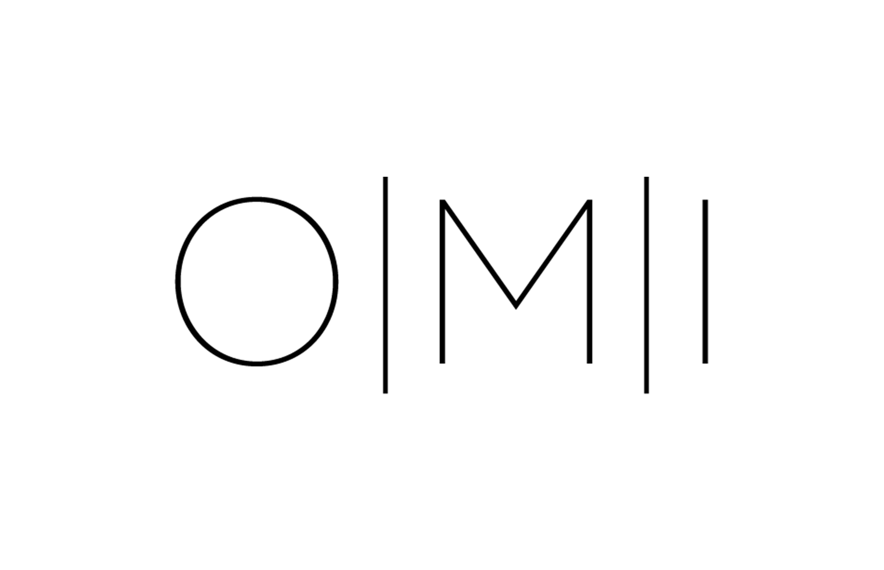
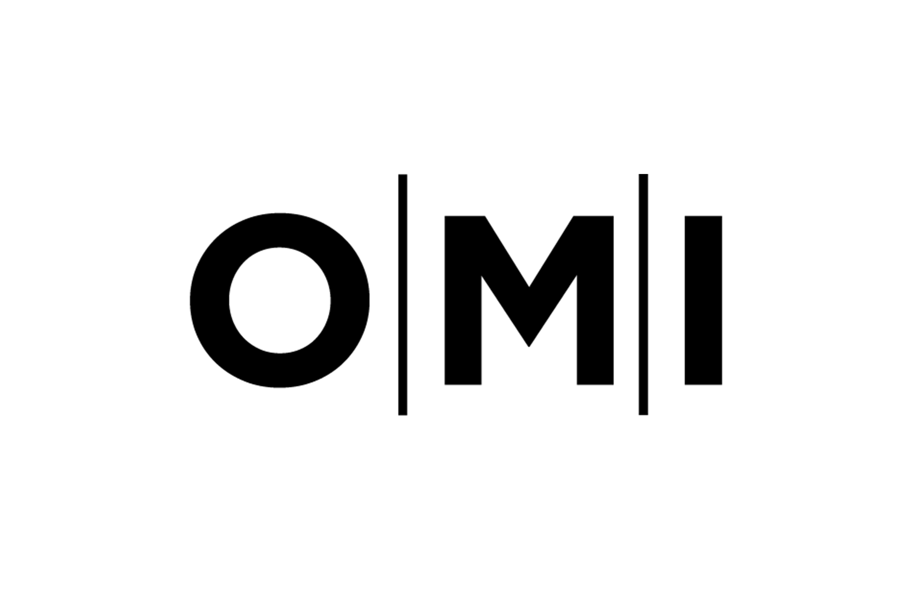


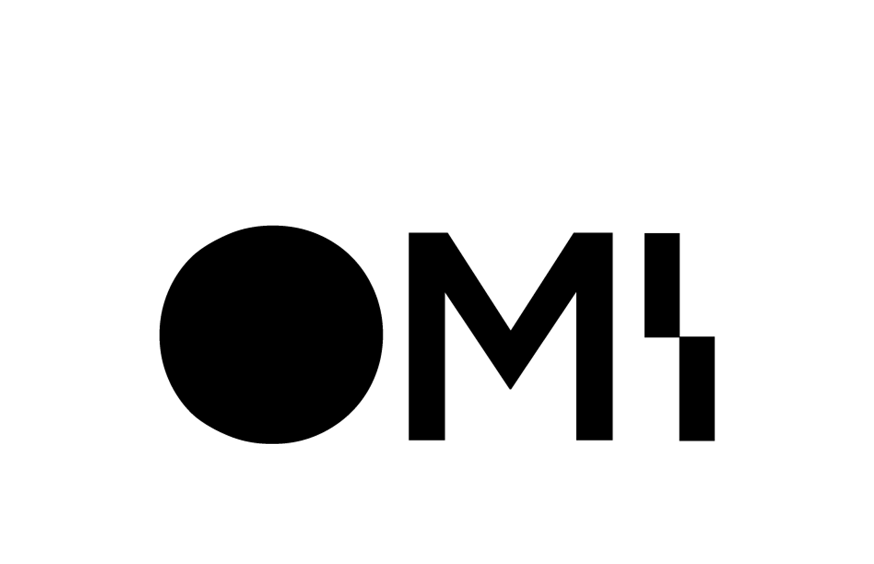


OMI (Office of Medicaid Innovation)
Visual design + Identity Systems,2023
Art Director Robert Zolna
Institute for Healthcare Delivery Design
Visual design + Identity Systems,2023
Art Director Robert Zolna
Institute for Healthcare Delivery Design
Identity Systems
Anthropocene Lab
is a new research program at UIC, lead by CADA faculty Beate Geissler. With support from the Humanities Innovation Grant Beate commisioned: Logomark, Poster and Web Mockup.
The academic field of the Anthropocene argues the world has entered a new geological epoch. Humans have altered the world fundamentally, “stratifying” natural and urban spaces. The logomark references the flattening of geological time, constrained to human grids and forms of understanding.


Logomark + Poster, 2022
with Josh Cook